We all know the importance of making a great first impression in our personal lives as well as our professional lives, and an e-commerce website is no different. Almost every detail of your e-commerce site is something the user might see on their very first visit, so it is vital that your site design covers all the bases in making the experience of doing business with you as streamline and hassle-free as possible.
Online shoppers have notoriously short attention spans, if you’re having trouble keeping users on your site long enough to make a purchase, check out these 5 tips to keep customers on your store.
Unappealling or confusing design will turn away your customers as they look for easier alternatives, so let’s look at how to avoid these critical mistakes:
#1 Basket Design

There are a lot of potential mistakes to be made when designing the online basket your customers will use. It’s something customers interact with every time they make a purchase, so if managing the shopping cart is a nuisance, users will simply shop somewhere more convenient.
Most established e-commerce platforms should have all the functionality you need, but whether you are creating a bespoke system or implementing a stock solution, you need to make sure your shopping cart isn’t frustrating users and turning them away.
Ensure you are providing all of the following features, and try to minimise the number of clicks needed for each action:
- Choosing quantities and other options from the product page. Don’t force your user through the add-to-cart process multiple times for the same product, and don’t rely on them waiting until checkout to specify these options.
- Allowing options and quantities to be changed and purchases removed from the cart. Users may change their mind about purchases as they browse your store and find better choices, so make it quick and painless to edit orders on the fly.
- Adding items to the cart without leaving the page. Make it as easy and fast as possible for users to fill their cart when coming to you for multiple purchases. If doing this is an ordeal they are likely to go elsewhere for future bulk orders.
- Display shipping costs in the basket. Seeing the price shoot up when heading to the checkout screen can be a nasty surprise and could make users feel duped; be open about the shipping costs of each item and keep a running total in the basket. This can get complicated if you offer multiple shipping methods, and you can get away with displaying only the standard rate here and offering additional postage methods at checkout.
- Handling multiple tabs. You want to encourage users to browse the site and find additional items on top of what they came to you for, and the way most visitors will do this is by opening everything that catches their eye in a new tab and sorting through the tabs when they are done browsing. It’s going to be a real nuisance if they can’t reliably add items to one basket from multiple tabs. If a user returns to your site at all after this experience, they will have learned not to browse for additional products or follow interesting links.
- Surviving the login process. Nothing is more annoying than searching a site and filling your basket with everything you need, tweaking all the options and heading to checkout only to be asked to login and have to do it all over again. If your site allows users to create a basket without logging in, make sure that basket will be preserved when they log in!
#2 Checkout Process
The key to ensuring a positive checkout experience is keeping everything as streamlined as possible. Make sure all the options can be tweaked from here as well as the shopping cart, and when it comes to taking information from the customer minimise the amount of work they have to do.
Use autofill functions to prevent customers from having to add duplicate information, such as defaulting the postage address to the billing address.
If you offer multiple shipping options, make sure these can be selected at the beginning of the checkout process. Have a look at Urban Outfitters’ checkout screen:
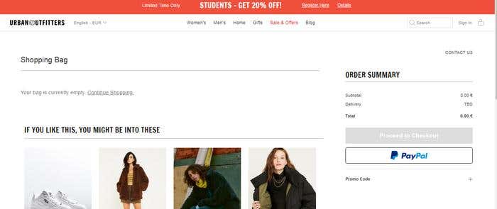
The user is given no indication how much shipping will cost, or even how much it will cost. All billing and shipping information must be provided and an account created before the user can find out. Going through all of that only to discover the cost is too high, or the items won’t arrive in time, is unappealing and many customers will simply leave at this point in search of a more transparent retailer.
Offer as many payment platforms such as Paypal and Google Pay as possible can get you a lot of on-the-go purchases where your customer is not going to fish out their credit card and enter all their details, such as if they are browsing on their lunch break or morning commute. These payment platforms also make it easy for you to offer the option of purchasing without creating an account. Nobody likes having to create an account, especially for a site they haven’t heard of and aren’t sure they’ll return to. Streamlining their first purchase with you increases the chance of that return visit, and customers are more likely to create an account once they know they will be coming back.
All of the same principles also apply to designing your account creation process. Making a great impression on your customer doesn’t stop once they’ve created an account, user onboarding experience plays also an important role here.
#3 Search Tools
The biggest mistake you can make with your search tools is not offering enough search options. If the user can’t find what they are looking for quickly, they will start looking on other sites for it instead. Make sure customers can search your products by:
- Category. Let users limit their search results to the type of product they are looking for.
- Price. As a minimum let users order results by lowest and highest price, ideally also allow users to limit the search with a minimum and maximum price.
- Relevance. If you’ve set up tags on your products listings your search function can use these to determine a product’s relevance to the search. Use these! Your customer will quickly become fatigued scrolling through irrelevant search results.
- Review score. For many customers, product reviews are the most important factor in choosing between products, so they will want to search for the highest-reviewed products in your store.
Creating an effective search engine is very difficult and very time-consuming. Unless there is a specific reason existing search platforms are not appropriate for your site, do not take on the considerable additional headache of creating this system yourself.
Without someone on your team who has experience building complex search engines, the end result will likely be less effective than a stock solution.
There are hundreds of search engines to choose from, and many e-commerce platforms offer an in-built solution, so you will need to do some research on the best fit for your site and audience.
#4 Listings
When it comes to the product listings on your site, one of the biggest mistakes you can make is to overload the user with too much text. While you should always display useful product information and specifications, be sure to maintain a visual focus in both search results and individual product pages, with large, clear images in a prominent position on every page.
There needs to be a good balance of appealing imagery and useful information. Here is what not to do:
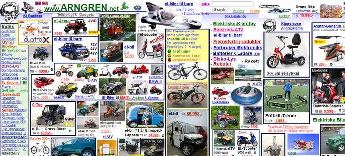
This layout is as baffling as it is eye-watering.
Arngren.net sells drones, RC vehicles and other electronics, but you probably couldn’t tell that from looking at this page. There is no balance between text and images and zero blank space on the page, and the result is a complete visual overload.
In the unlikely event a user is tempted to click onto a product page, things only get worse:
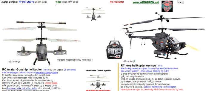
Images are distributed in a completely scattershot fashion and do not demonstrate the product. The text is barely formatted at all and suffers from the same lack of blank space mentioned earlier.
If this page were to convince a visitor to buy, how would they even do that? By clicking the price, of course! There is no buy button at all, and nothing to suggest that this is how to proceed. This is a textbook example of how to turn away a customer.
The pictures on a product listing should be chosen to demonstrate the product in an appealing way rather than just show what it looks like, and the text itself should give enough information for customers to make an informed purchase, and must be unique. Your product pages will get poor search engine rankings if they are simply duplicating product descriptions found elsewhere.
Want to know how to write the most effective product descriptions? We’ve got an article for that.
Make the buy or add-to-cart button easy to find on the page, and check that all buttons on the page are easy to tap on a small phone screen. Always display related products to what the user is looking at to inspire additional purchases while you already have their attention.
#5 Unnecessary Bespoke Platform
Creating a bespoke platform for your e-commerce site is a huge mistake. Creating a platform with everything you need will take a long time, and there are bound to be teething troubles of some kind once the site goes live.
Platforms like Shopify and Magento can be configured for selling almost any kind of product, and will save you time and development costs. These platforms have already been stress-tested by thousands of online businesses before you; less will go wrong and when something does, you will have a wealth of online information and the support of your chosen platform to solve the problem.
Most customers value familiarity when it comes to online shopping, and expect your site to work in a way they are already accustomed to. Coming up with a brand new sales platform can actually hurt you here, as online shoppers are often wary when the process of buying from you is not what they have been taught to expect.
#6 Trust Factor

Failing to consider your site’s trust factor can be a major misstep. It doesn’t matter how great your products are if users don’t feel safe enough to do business with you.
Making your site look trustworthy is easy to do, and you should be doing all of these things anyway:
- Professional-looking visuals.
You should always want your business to look as good as possible anyway, but a website that looks unprofessional or cheaply made can give the impression it was quickly thrown together to make a quick buck. Make sure your site is visually on par with the competition. Creating a clean and sleek theme and a strong logo both fall into this category.
- Use tried and tested payment platforms.
Third party payment systems like Amazon Pay
Avoid following key mistakes while creating and setting up your new e-commerce website. Make sure that your customers find it easy to use.
give users a lot of reassurance that you are a legitimate business, whereas when a customer gets redirected to a payment system they have never heard of, alarm bells will start to ring.
- Make it easy to find information about your business.
That means providing an FAQ section as well as information on your returns and shipping policies, as well as the systems you use to keep customers’ data safe. You don’t need to write an essay for any of these as most users won’t read them, but they will check to see that they are there. A paragraph or two introducing your business in an About page can also do a lot to build trust in your brand.
You should also register with any trust marks relevant to your industry, and display their logos prominently alongside your payment system logos, as this will provide a lot of reassurance to visitors.
#7 Inadequate support for mobile devices
Far too many sites are still only optimised for computer browsers and not phones and tablets. This is a serious oversight, as more and more people use their mobile devices as their primary means of accessing the internet, and in many cases don’t even own a laptop or desktop anymore.
Make sure your site is visually consistent across all devices. This could mean a redesign of desktop/laptop version of the site as well as mobile versions.
The easiest way to check your layout is simply to right-click the page in your browser and select Inspect Source, and then choose your target device under Device Layout or Emulation, depending on the browser you are using.
When showing your site to friends and family, ask them to use as much of the site as possible and let you know if they run into any errors or bugs.
#8 SEO Errors
And finally, it is worth mentioning a few of the most common mistakes you can make when it comes to SEO. Google are rather secretive about their search ranking formula, but these 3 factors will always negatively impact your ranking:
- Duplicate pages. Avoid having multiple pages with identical text on them - most search engines, including Google, will notice this and it could place you lower in search results.
- Redirected links. Redirecting a broken link to related content on your site is certainly more user-friendly than allowing them to hit a 404 page, however it will still reduce your ranking.
- Unlinked pages. Is every page on your site linked to from elsewhere in your site? If not, firstly your customers will likely never find it or even know it exists, but it will also damage your SEO when a search engine detects this.
Using website crawling tools such as Moz to find redirected links, 404 pages and unlinked pages is the easiest way to deal with these problems.
Final Words
Recent research suggest at least 74% of customers will bail out of an online purchase at some point before making the payment. With poor site design that irritates your users, they won’t even get that far.
Remember that the golden rule of selling applies to e-commerce perhaps more than any other market – make it easy for people to give you their money, or someone else will!
If the least technically-savvy person you know can’t easily navigate your site without your help, your site design is going to cost you sales.
Now that you know what not to do, why not brush up on the latest trends in E-commerce site design?