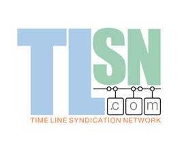
Design a Logo for TLSN.com

  • Stare: Closed
  • Premiu: $50
  • Intrări primite: 10
  • Câștigător: stanbaker

Sumarul concursului

I need a logo for TLSN.com. The letters stand for Time Line Syndication Network, which may or may not be part of the logo... you show me what works best. It would be nice to have an icon/graphic but ONLY IF it ties to the name or has the appropriate connotation, but I don't have any ideas along those lines yet... hopefully, YOU WILL!

I look forward to seeing your designs.

- MUST BE READABLE. Nothing so stylish it is hard to figure out. It should be CLEAR at a GLANCE.
- Choose a complementary BUSINESS color palette that catches your attention but is still pleasing to the eye. I DO NOT want anything too gaudy or garish. Or amateurish... if I think I can make it MYSELF, I will immediately reject the entry (because I do not want to do it myself but will not pay someone for THAT). I want a more professional "look".
- SIMPLER is better than COMPLEX. Don't just throw a bunch of clip art out there... have a reason for it. If it looks like something seen a thousand times, don't do it. Perhaps it just has clean lines, maybe it's made abstract in some way, I'm open to your creative ideas.
- I think I DO want .com to be a part of the logo, unless your design convinces me otherwise, but it should be small/subtle. A whisper that doesn't take attention away from the actual logo.

How is that for a CHALLENGE? You cannot get too fancy and yet it must be different, engaging, and business-like. This will be a HARD goal to achieve... especially when you consider there are really only FOUR LETTERS in the logo (

Please deliver the ORIGINAL ART files and exact font name(s) used so I can adapt the logo in the future if needed. At minimum, I want the LAYERED format (not flattened) files.

LAST... I know you spend valuable time on this content, so let's please spend it well. DO NOT just post a message asking me to look at your entry... trust me, I WILL look at it. See previous contests, for example:

https://www.freelancer.com/contest/Design-a-Logo-for-PODDVRcom-32906.html
https://www.freelancer.com/contest/Design-a-Logo-for-VIZDEXcom-47349.html
https://www.freelancer.com/contest/Design-a-Logo-for-OnePageWebAppcom-49133.html

And I will post comments from time to time (or send a private message) to share my thoughts... which guides this to a better logo for me. I promise to provide some feedback. Feel free to ask specific questions, though.

Thanks for your time and effort.

Aptitudinile recomandate

Feedback de la Angajator

“@stanbaker won the contest on 9 December 2013”

Imagine de profil gluedtothescreen, United States.

Panoul public de clarificare

  • gluedtothescreen
    Titularul concursului
    • acum 10 ani

    If anyone is interested:
    https://www.freelancer.com/contest/Design-a-Logo-for-TimeLine-Player-51112.html

    • acum 10 ani
  • gluedtothescreen
    Titularul concursului
    • acum 10 ani

    don't know if designers get this message, but you might look here:
    https://www.freelancer.com/contest/Design-a-Logo-for-AnnotatedTimeLineORG-50218.html

    • acum 10 ani
    1. stanbaker
      stanbaker
      • acum 10 ani

      On my list but I am swamped with work. Hope to get to it soon.

      • acum 10 ani
  • DaDiablo
    DaDiablo
    • acum 10 ani

    Congratulations CH. and Stanbaker.. :)

    • acum 10 ani
  • gluedtothescreen
    Titularul concursului
    • acum 10 ani

    Alright, everyone.. I think we're about as far as we need to go. This has been a fun contest and it yielded a LOT of VERY GOOD entries, which makes it hard to decide but there are things to do...

    Hopefully, we meet again (more contests to come). I do wish you all peace and good will... and a sincere appreciation for the TIME and EFFORT I know you put into your entries. Like a lottery, there are winners and losers. UNLIKE a lottery, it is NOT a random choice... and I will share these thoughts with you designers for future consideration:

    - have a plan... a "look" you want to convey, even if it is a little out of the ordinary. Just BE CONSISTENT and make ALL elements of your design work well together.

    • acum 10 ani
  • gluedtothescreen
    Titularul concursului
    • acum 10 ani

    part 2:

    - decide on a color palette. As you all know very well, it can be changed in an instant. Did you see what happened with some recent entries? So pick something that LOOKS GOOD TO YOU and see if you can find some common ground with your customer. I might over-ride your choices, but maybe not. And RESPECT IS EARNED (from me as well as the other designers) if you develop a nice color theme.

    - read, listen, think about what REQUIREMENTS get laid down. I don't always like them, but I make decisions on certain things for certain reasons and that's just it. go with it.

    - simplify. often.

    thanks

    • acum 10 ani
  • gluedtothescreen
    Titularul concursului
    • acum 10 ani

    hey, dennisbella... I am still intrigued with your original entry #70. I think 105 is closer to a winner but STILL not a winner... and it doesn't have the charm of the other. See if we can add back the SPARK of the first one:

    Maybe bring back the clock by making the L larger and the same orange as hand in 70. This will make the letters offset, maybe change those font sizes?... but it MIGHT add back the quirky of the first design... not sure.

    Oh, gotta have the full name, too... see below. Maybe just all lower case in small print along the bottom, so the dot rests on it? get creative, if you care to try. This may be a long shot.

    thanks.

    • acum 10 ani
    1. dennisabella
      dennisabella
      • acum 10 ani

      on it sir but first take a look at the polished timeline. thanks

      • acum 10 ani
  • TheRoyalsExile
    TheRoyalsExile
    • acum 10 ani

    please qoute the color which are prefeered

    • acum 10 ani
  • gluedtothescreen
    Titularul concursului
    • acum 10 ani

    I appreciate the really good ideas everyone is presenting! I know I'll end up with a nice logo but the decision will be hard!!

    I am narrowing the field and making final decisions on the logo itself. I now realize a short .com is great BUT you really must "spell it out" for people, so the logo MUST INCLUDE these words:

    TIME LINE SYNDICATION NETWORK

    It's a lot so I'm fine if it is VERY SMALL... like lawyer print!! ha! ... or VERY FAINT... just a hint. I do NOT want it to overwhelm the TL or SN or anything else. It is only there because some people might need it.

    thanks again for your continued time and effort!

    • acum 10 ani
  • tota999
    tota999
    • acum 10 ani

    Your Feedback Please #125

    • acum 10 ani
  • gluedtothescreen
    Titularul concursului
    • acum 10 ani

    #70. On the one hand, this design MIGHT look amateurish but seems too well constructed, in my opinion, for that to be the case. Or maybe lucky beginner? On the other hand, it is almost AVANT-GARDE! Nice job. Which does NOT mean it's going to win. It's different enough for me to look again.

    So, dennisabella, public feedback and we'll see what happens...
    -- I don't like the extra hand on the clock,but it appears you added that +color to make it stand out and flow to the .com. Let's delete it.
    -- We cannot have letters on top of each other like that... NO CONFUSION. So let's shift TL left to fill the upper left quadrant... and SN to the lower right quadrant. Given the arrangement, try making both TL and SN the same size and same blue color.
    -- Drop the .com to the bottom, up against the N and make lighter gray

    Thanks for EVERYONE's continued efforts!

    • acum 10 ani
    1. dennisabella
      dennisabella
      • acum 10 ani

      THANKS sir, your judgement and instructions are so professional, i'm on it right away. will try another entry, thanks again sir.

      • acum 10 ani
  • gluedtothescreen
    Titularul concursului
    • acum 10 ani

    EVERYONE:

    I mentioned the TIME theme and the clock shows up everywhere... and that may be what we use. But the actual them is a TIME LINE, which is just a series of events shown along a string of dates, past to present to future. Just a reminder.

    The "art" part of the logo does not have to be LITERAL (ie- a clock). It could be ABSTRACT (implied by a brush stroke or two). It might be BIG, like #70 clock dial... huge! Or small, or BOLD or faded. Just make it "fit in".

    • acum 10 ani
  • gluedtothescreen
    Titularul concursului
    • acum 10 ani

    If you care to try:

    29, 40, 60 - I see where you're going with the clock symbol... and like that direction... but would like to see the L of the TL be the hands on the clock but somehow work the T in front still. In other words, the TL stay together even though the L also depicts the hands of the clock. They should be most prominent and about the same size.

    Then, put the SN right after the TL but make those letters somewhat SMALLER and maybe difference color, not sure. Less prominent... might also help with the transition out of the clock.

    48 - sorry, the T still looks too much like a Y. The letters must be CLEAR and READABLE... and symbols around them should be subtle, not confusing.

    thanks!

    • acum 10 ani
  • gluedtothescreen
    Titularul concursului
    • acum 10 ani

    45 - nice concept but POOR execution... MUST BE READABLE. The hands of the clock mess it up. Maybe that can be fixed? I don't know.

    I am liking the idea of TIME or TIMELINE being the basis for the graphic/icon aspect of the logo.

    And maybe the letters can be emphasized differently? I like the idea of TL being larger (or diff. color or something) and SN being less prominent.

    Again, it would be nice to work in the actual words (TimeLine Syndication Network) even if in very small block font along the bottom, so maybe it looks like a bar/underline or something. Just trying to imagine a way to get that in. (OK, I know this contradicts what I have said to some about simplifying... and I may indeed end up following my own inclination... but I do want to see how it MIGHT look. I wouldn't want to add it if it didn't not bring "value", which it does.)

    I am tired of the SWOOP thing... very old UNLESS you have something really, really, really special.

    • acum 10 ani
  • gluedtothescreen
    Titularul concursului
    • acum 10 ani

    PLEASE DO NOT POST A MESSAGE UNLESS YOU HAVE A QUESTION OR COMMENT. I promise I will look at EVERY entry.

    • acum 10 ani
  • gluedtothescreen
    Titularul concursului
    • acum 10 ani

    PLEASE DO NOT POST A MESSAGE UNLESS YOU HAVE A QUESTION OR COMMENT. I promise I will look at EVERY entry.

    • acum 10 ani
  • pixelke
    pixelke
    • acum 10 ani

    Would you please share your thoughts about #21?

    • acum 10 ani
  • gluedtothescreen
    Titularul concursului
    • acum 10 ani

    A little feedback...

    I've rejected a bunch of entries, too plain or similar to others. You might take a look to see things I do NOT like.

    Some entries have some potential but are trying to do too much, I think. For example, here's what I would do to the following:

    12 and 29 - delete the radio waves or whatever from the upper right, you already have a clock.
    7 and 8 - make the .com less prominent. For that matter, 7 should reconsider that whole right image or it will be rejected soon... I want some symbolism that connects.

    I want to be very careful with the graphics so that it does NOT look like another letter in front of TLSN. For example, I sort of like 28 (though the top of the T is too long, in my opinion) but the large semicircle ALMOST looks like an O. Maybe changing it will be better... but it will not win that way.

    And I do want a business-like feel to it... the hand on the clock on 29 is a bit cartoonish.

    • acum 10 ani
  • gluedtothescreen
    Titularul concursului
    • acum 10 ani

    Just a few quick points, so you know I'm paying attention:

    SMALL .com, please. It should NOT take away from the TLSN.

    I like the idea of tying in the TIME concept, like 12. Nice, but don't overdo... no need for even more "things" attached to the image... keep it simple.

    Maybe even distinguish between the TL and the SN? The TL is definitely more important.

    I do like the whole name near the letters like 7, but I doubt that will work for all logos. Don't force it. If something doesn't work, think of something else.

    My ratings are to give you a relative idea of how I rank your entry for MY purposes... to give you some guidance on the "look" I prefer. Don't take it personally... I would rank them differently if the logo was going to be used in some other way.

    Thanks for your entries... off to a good start.

    • acum 10 ani
  • dinaroid
    dinaroid
    • acum 10 ani

    Please leave feedback on #14 . Thank You!

    • acum 10 ani
  • gluedtothescreen
    Titularul concursului
    • acum 10 ani

    It will be primarily business-to-business venture targeting individuals/organizations that produce periodic web media (audio, video, images, text, data, etc).

    The goal is simply to distribute (syndicate) their content, either directly to end-users and/or through partners. That content will be structured and delivered utilizing an interactive, web-based TIME LINE navigation platform. This group of providers/partners are loosely referred to as a network.

    Hope this helps.

    • acum 10 ani
  • TheRoyalsExile
    TheRoyalsExile
    • acum 10 ani

    please elaborate upon the company hint indicating nature of work and customer involved

    • acum 10 ani

Afișează mai multe comentarii

Cum să începi concursurile

  • Postează-ţi concursul

    Postează-ți concursul Rapid și ușor

  • Obține o mulțime de intrări

    Obține o mulțime de intrări Din întreaga lume

  • Premiază cea mai bună intrare

    Premiază cea mai bună intrare Descarcă ușor fișierele

Postează un concurs chiar acum sau înregistrează-te astăzi!