Freelancer:
jokubas00
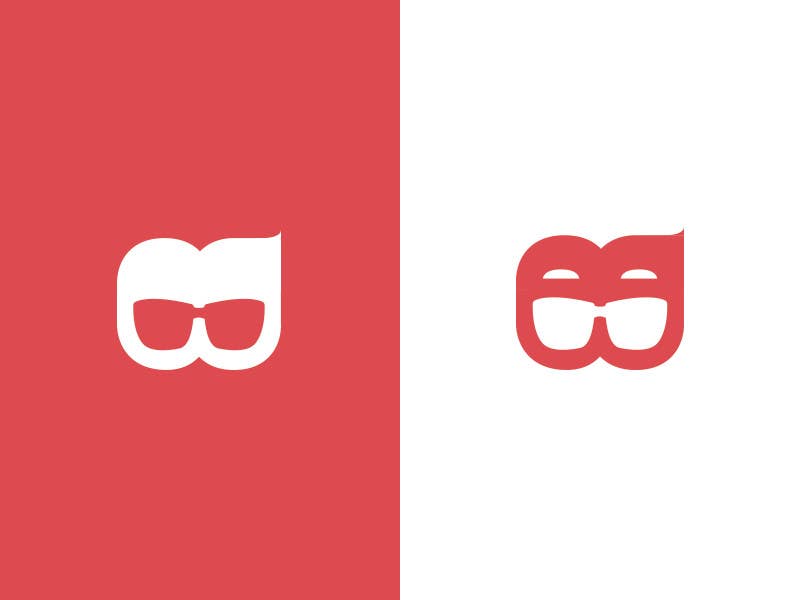
RB Logo proposal 2
Please read - While keeping the same shape guidelines and concept, a new feature has been introduced - sunglasses in the negative space. the word "Sun" has been removed, as it is not necessary. The letters RB are a little less noticeable in exchange to the whole shape being like a top part of a face. The eyebrow-like shapes are optional. Everything is original and vector-based. The previous proposal can be taken in consideration too.


